Image by ThisisEngineering RAEng from Unsplash
Images in teaching materials and communications
Content reviewed June 2023
Your class is in part a visual presentation, typically an audio-visual presentation. Some barriers learners might be facing with the visual portion of your content include one or more of the following:
- Viewed in very bright or extremely dark environments
- Low vision or legally blind
- Visual processing disorder or Irlen Syndrome (Scotopic Sensitivity Syndrome)
- Neurominority (dyscalculia, ADHD, dyslexia, or autism)
- Prefer to listen to sessions
- Have a photosensitive epilepsy
To improve learning outcomes and knowledge transfer to students we have some practical steps for you to follow.
- Types of images
- Planning for images
- Communicating
- Example of including an image
- Chart: Salary distributions across departments
- Image references
- Special considerations for data visualizations and maps
- Designing data visualization for e-learning
- Data visualization references
- Digital media help for your online course
Types of images
Images or visual resources can include any of the following:
- Word clouds and word art
- Photographs
- Art reproductions (photos of art)
- Graphs
- Charts
- Clipart
- Maps
- Illustrations
- Technical drawing or illustrations
- Medical diagrams
- Screenshots
Planning for images
- Assess if the cognitive load for understanding a chart, graphic or data visualization can be reduced by simplification or redesign. This includes filtering to only show the key data and directly labelling the data instead of using legends.
- Ensure the data visualization or infographics have good colour contrast and use a colour-blindness accessible colour palette (Go to the Designing data visualization for e-learning section to access a free course. Section 3 focuses on colour.)
- For data visualizations, use redundantly coded drawings with fill patterns or different dashed lines (Go to the Designing data visualization for e-learning section to access a free course. Section 4 focuses on formatting.)
- Review the image to ensure you can advise the audience of triggers such as violence or high-contrast visual patterns, especially stripes of contrasting colours which can trigger seizures or using bright or fluorescent colours, which can be overwhelming and cause problems for people with sensory issues like Irlen Syndrome or autism.
- Build advance notice of the trigger into the presentation and allow ample time for people to opt-out of viewing the image. For a recorded presentation, tell them the timestamp of when to return to viewing.
- Ensure that digital imaging systems like confocal microscopes, CCD cameras and array imagers use the combination of colours that is most understandable to the audience. Or convert images to colour combinations that are better for viewing.
- If the image is decorative only, mark it as decorative or write decorative in alt-text. Note: Logos are not decorative; they should say the institution or organization name followed by the word “logo” unless you are comparing logos from a graphic design standpoint, where you should be more descriptive of elements of the logo.
- Review the alt-text for the image if it exists and edit it for accuracy and for its use in the context.
- If no existing alt-text exists and it is not a decorative image, generate an alt-text
Communicating
- Communicate about the image as if people will not see the image.
- Create an image title that includes the point of the image to reduce the cognitive load of understanding the image.
- Provide a summary of key points to look at to describe where in the image they should be focusing.
- Point to areas of interest with on-screen tools (not laser pointers, which cannot be seen online), use directional words and describe where you are pointing. This helps learners track where on-screen you are pointing to faster.
- Replace phrases like “This part here is the …” or “This is where we attach it to the red side” with phrases that describe, “In the upper left side there are two wires …” or “Under the flowers’ outermost petals are the green sepal leaves.”
- For data visualizations, avoid using only the colour names to describe the component you referring to. Instead, try using colour with shape, dashed line pattern and position, or describe what the component is representing.
- Replace phrases like, “The red bar is twice as high as the green bar.” Instead, say “Canadian sales of wheat are twice the Australian sales of wheat in Indonesia.”
- Host image files with alt-text used in the synchronous presentation online. This allows learners to review the image asynchronously with coloured overlays if needed or have access to alt-text.
- When summarizing or transitioning to the image replace phrases like: “As you can see”, “You can see here” or another phrasing that assumes that everyone is looking at the image and is able to see the same way with, “This image displays …” “This chart shows … “, “This picture captures …”
Example of including an image
The chart “Salary distributions across departments” displays the percentage of total salary compensation, not including commissions and bonuses, at a typical mid-size financial services firm in Canada. With this data, we learn that 60% of salaries are for accounting and sales. This is why increasing productivity within accounting and improving sales conversions is critical to lower overall salary costs.
Chart: Salary distributions across departments
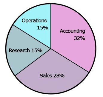
Chart image from Brandeis University
Chart: Salary distributions across departments Long description with data
Pie chart of salary distributions across departments in a typical financial service business. There are four departmental salary groups:
- Accounting 32%
- Sales 28%
- Operations 15%
- Research 15%
Image references
Images Tutorial by W3C
Student accessibility services handbook for faculty and staff by The University of Manitoba Student Accessibility Services
InklusivComm Interviews by Denis Boudreau
Adults With Visual-Spatial Learning Disabilities by Learning Disabilities Association of Ontario (LDAO)
accessible data viz is better data viz by Amy Cesal for Storytelling with data
Color Universal Design (CUD) – How to make figures and presentations that are friendly to Colorblind people” – by Masataka Okabe and Kei Ito
Special considerations for data visualizations and maps
Modified from “Color Universal Design (CUD) – How to make figures and presentations that are friendly to Colorblind people” – by Masataka Okabe and Kei Ito
The best practices include redundant coding of data visualizations, maps and flowcharts.
- Do not convey information with colour only.
- Show differences both in colour and shape.
- In addition to colour use the combination of;
- solid and various dotted lines
- various hatching or fill patterns
- various simple geometric shapes such as circles, triangles, rectangles or stars, and
- use the alphabet and numbers.
- Keep the number of colours to a minimum.
- Use a combination of different symbols with a few colours rather than a single symbol with various colours
- Make it possible to communicate without using the colour name.
For more in-depth details on this go to the Designing data visualization for e-learning section to access a free course.
Designing data visualization for e-learning
To learn more about how to create accessible data visualizations we recommend this free course from the United Kingdom’s Government Analysis Function division which includes 11-parts:
- What is data visualisation?
- Choosing visualisations
- Accessibility and colour
- Formatting rules
- Bar charts
- Clustered bar charts
- Stacked bar charts
- Line charts
- Pie charts
- Publishing charts
- Tables
Data visualization references
Color Universal Design (CUD) – How to make figures and presentations that are friendly to Colorblind people” – by Masataka Okabe and Kei Ito
Data visualisation e-learning by United Kingdom’s Government Analysis Function division
Digital media help for your online course

Looking for help with data visualization, infographics, illustration other visual resources for your online, blended or distributed course?
Book a one-on-one “Creative Media Consultation” with our digital media specialist to begin your project today!
You may also be interested in


Equity, Diversity, and Inclusion in Online Teaching: Where to Begin